How to utilize the SIT Pulse Dashboard effectively?
The SIT Pulse Dashboard is designed to provide a comprehensive overview of the SIT phase. This dashboard is particularly beneficial for Testing Managers, Test Leads, Project Managers, and Higher Management, offering real-time insights into the progress and status of test cases, defect resolution, and execution timelines. By using this guide, users will understand how to effectively leverage the dashboard's features and KPIs to ensure a smooth and efficient testing process.
Pain Points
- In complex projects, tracking the status and progress of SIT can become challenging.
- Without a clear view of test execution, defect resolution, and priority breakdowns, ensuring timely completion and quality delivery becomes difficult.
The SIT Pulse Dashboard simplifies the monitoring process by providing a detailed, real-time view of key testing metrics, ensuring stakeholders can make informed decisions quickly.
Pre-requisites
Before diving into the SIT Pulse Dashboard, ensure the following prerequisites are met:
- User Access: Ensure you have the necessary permissions to access the SIT Pulse Dashboard.
- Test Case Creation: Ensure you have created test cases in the Test Case page of Digital Labs or the Test Case page of the Transformation Hub.
SIT Dashboard Overview
The SIT Pulse Dashboard is divided into multiple sections, each providing a specific set of KPIs and metrics. Here's a breakdown:
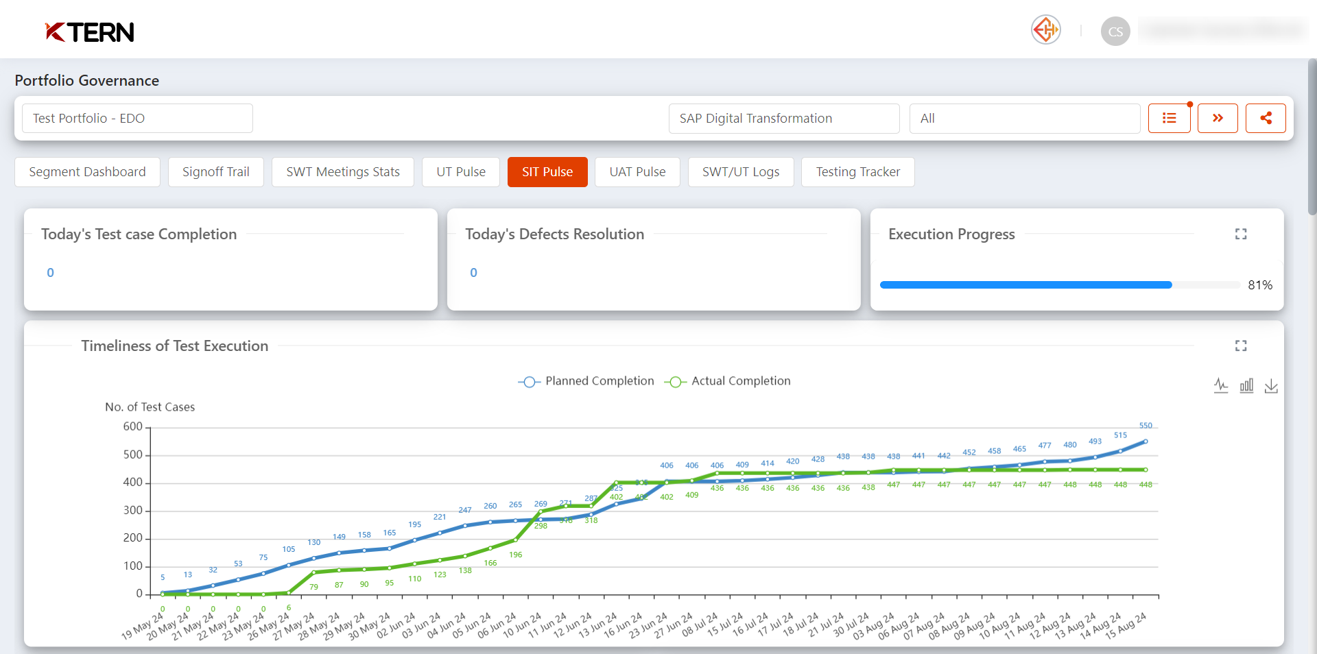
- Today's Test Case Completion
Displays the number of test cases completed on the current day. This is crucial for Testing Managers to track daily progress. - Today's Defects Resolution
Shows the number of defects resolved today, allowing Project Managers to assess the effectiveness of the testing team. - Execution Progress
Indicates the overall test execution progress as a percentage. This KPI is essential for Higher Management to understand the current state of testing. - Timeliness of Test Execution
- A chart comparing planned vs. actual test case completion over time. This helps Test Leads to identify any delays and adjust resources accordingly.
- The line graph (default view) is represented by the first icon. To switch to a bar graph, simply click the second icon.
- You can easily toggle between these views or opt for a full-screen display by selecting the [ ] icon. If you need to save the graph locally or share it, use the download icon.
- Priority Breakdown and Status Overview
- Priority - Status Test Case Breakdown
- This section categorizes test cases by their criticality (Critical, High, Medium) and their status (New, Active, Defect Found, Performed).
- Test Leads can use this to prioritize efforts on high-impact test cases.
- Priority - Status Defects Breakdown
- Displays the number of defects based on their severity and status (Open, In Progress, Not Feasible, Completed).
- This is useful for Testing Managers to allocate resources to resolve critical defects promptly.
- Defect Evolution: Created, Resolved, and Planned
- This section offers a visual representation of the defect lifecycle, showing the number of defects created, resolved, and planned, as well as the total number of defects created daily.
- You can effortlessly switch between the line graph and bar graph views or choose a full-screen display using the [ ] icon. To save the graph locally or share it, simply click the download icon.
- Project Managers can monitor defect trends over time to anticipate potential risks.
- Test Plan Summary: Cases & Status
- Lists the total number of planned and actual test cases across various modules or test plan.
- This summary helps Higher Management quickly assess the overall test coverage.
- In each test plan, if the actual test case completion is less than 50%, it will be denoted in red. If the actual test cases are greater than the planned, the title will be highlighted in green.
- Provides a status update on test cases (New, Active, Performed, Defect Found, Approved), aiding Test Leads in understanding where the majority of the testing efforts are currently focused.
- Test Scenario Summary: Cases & Status
- This section dives deeper into specific test scenarios, offering a detailed breakdown by test cases.
- Testing Managers can use this to identify test scenarios that may require additional focus or resources.
- In each test scenario, if the actual test case completion is less than 50%, it will be denoted in red. If the actual test cases are greater than the planned, the title will be highlighted in green.
- Test Case Allocation and Completion Tracker
- The Resources Testcase Tracker provides a detailed view of individual tester performance, showing the number of test cases each tester has planned, completed, and the defects they have identified.
- This tool is invaluable for Test Leads and HR as it allows them to monitor tester productivity, identify top performers, and optimize resource allocation to ensure efficient and effective test execution.
- Filters and Columns for Customized Views
The SIT Pulse Dashboard includes various filters and columns to tailor the view according to your needs: - Filters: Across the KPIs, you can filter data by date, module, severity, and tester. This is particularly useful for Testing Managers who need to focus on specific aspects of the testing process.
- Columns: Customize your view by adding or removing columns to display the most relevant information for your role. This flexibility ensures that each user sees only the data that matters most to them.
By following this guide, users can fully leverage the SIT Pulse Dashboard to gain valuable insights into their testing processes, ensuring a more streamlined and efficient SIT phase.
Related Articles
How can Testing Managers and Project Leads Effectively Manage Project Issues using KTern's My Portfolios - Issue Log?
Effectively managing project issues is critical for keeping projects on track and ensuring timely resolutions. KTern's My Portfolios - Issue Log offers a comprehensive solution for tracking, prioritizing, and resolving issues, enabling teams to ...How to Leverage the CEO Dashboard for Strategic Insights?
The CEO Dashboard within the "My Portfolios" section provides a high-level overview of critical business metrics, tailored specifically for executive leadership. This dashboard is essential for CEOs and senior executives who need quick access to ...How do you access My Portfolios from KTern.AI application?
To access "My Portfolios" in KTern.AI, follow these steps: Start by logging into your KTern.AI account. Upon logging in, you will be taken to the Home - Project Launchpad page. If you are inside any project, click on the "KTERN" logo located at the ...How to govern the Project Portfolio effectively using KTern.AI My Portfolios?
Click on the drop down and select the desired portfolio. 2. KTern provides several KPIs to help govern the project on a daily basis: Portfolio Highlights: This KPI offers an overview of the project, including general details, analytical ...What's The Purpose Of KTern's Dashboard?
Introduction KTern as an automated platform aims to provide the user with dashboard where the complete project progress can be tracked. The Dashboard includes: 25+ KPIs based dashboard and workspace Automated charter, test, meeting reports Resource ...